Blog Leaving my comfort zone
Tagged: Thoughts Data | Posted: Wed, Feb 21, 2018 approx. 11 min read
I’ve recently volunteered to take part in a JISC funded project around developing data dashboards. This blog post is my way of making sense of what I did, how it went and what I learnt. Before I talk about my efforts I need to explain a little about the context. The two organisations supporting this activity are
HESA
the official agency for the collection, analysis and dissemination of quantitative information about higher education in the United Kingdom.
and JISC
Jisc (formerly the Joint Information Systems Committee) is a United Kingdom not-for-profit company whose role is to support post-16 and higher education, and research, by providing relevant and useful advice, digital resources and network and technology services, while researching and developing new technologies and ways of working.
The two organisations work closely together on lots of things, one of those being something called HEIDI Plus which aims to make the data HESA collects available to members to provide Business Intelligence to the sector. As part of the continuing initiative to develop the HEIDI Plus service, Community Dashboards have been developed. These are meant to use the knowledge and skills of experts in the sector to build the products the sector needs. I volunteered to part of a team that would produce some exploratory dashboards as candidates to be taken forward and further developed to become community dashboards. I can’t quite remember how I found out about the labs - It’s likely it was mentioned on twitter by one of the very engaged people who post interesting data visualisations.
Anyhow, I sent in an application and to my surprise was selected.
What did I learn
As you’d expect from a body serving the HE sector, there was a clear set of learning outcomes in the form of ‘core competencies’ that I could expect to address with my participation. So in each of those competencies I’ll round up how I did.
Agile Working
The way of working was described as Agile, but without any particular adherence to a particular framework. The team I was placed on had a Product Owner, and a Scrum Master, and we would work in a series of daily sprints to enable everyone to contribute whilst not taking them away from their respective posts.
We used Basecamp and Trello for our project management tools. Of all the competencies I felt this was one I was most experienced with, but even this had a few surprises. I’ve used basecamp a lot and am pretty comfortable with it - it’s great for sharing files and then discussing them, but that didn’t seem to happen much - Likely because people were restricting their work on the sprint days (more on those later) and I guess wanted to get into the work rather than the meta tasks around the work.
For the work on the sprint days we used Trello boards which were a bit new to me, and I wasn’t as comfortable with them. Similarly to the Basecamp issue it felt that it wasn’t really a core activity in the way that a team using a board every day to get the work done comes to rely on and invest in the maintenance of the board, the nature of the work and formulation of the team meant that it felt a bit like a chore to be done rather than a tool to facilitate it. The Scrum manager did their best to get updates and tasks organised in the most helpful way, but it felt like fighting against the tide of the way the team and sprints were setup.
In a more permanent team those tools would be crucial to maintain a useful structure and focus - with the limited time we had it felt like those things fell by the wayside in favour of the work getting done. The scrum master and product owner then had more work to coordinate things, but it ended up being pretty agile because the work got done.
As part of the Agile workflow we worked on developing some interesting user stories around data, as well as developing some that had come out of previous teams. Once we’d narrowed them down it was time for the next step. In hindsight I think the user stories were an area that we could have narrowed down a little, but it was difficult to know that whilst the team was forming and we were getting to know the process.
Transforming Data
One of particular core tasks from the team was to identify what data we wanted from HESA so that we could put in a Data Order, and then be supplied with the data to work with. So we had to identify what data we understood that HESA could provide, what other data sources we might want to use and do quite a lot of work trawling the HESA site. This was fascinating for me. HESA collects data on so many activities across Institutions and the sector that it has a rich seam to be mined and needs lots of domain experts who understand all the acronyms that Universities love, how the data is collected and it’s limitations. There were quite a few University Business Analysts and Planners on the team, so it was a gentle introduction for me.
Making decisions about useful data and what to ask for was instructional. During the days we spent thrashing out what we needed it illustrated how important a step this is - getting the data requires a thorough understanding of it to make it suitable for interrogating.
Also in this area was something that I learnt by watching rather than doing. We had a demo of a tool called Alteryx Designer - which used a workflow metaphor to clean up the data (amongst a tone of other things) and cleverly, keep all the steps that were done - crucial if you want to be open about your sources and what you did with them. In the end, the amount of data that we required meant we had to accept some compromises - so for my dashboard I could only get 3 years worth of data instead of the original 10 years request, meaning that the dashboard would be more of a proof of concept that a fully formed product.
Visualising Data
Starting the project, this was the thing I was most looking forward to. I’ve been taking my own small steps with PowerBI and Tableau, but was looking forward to learning from people more experienced than with some interesting sector based data. Tableau is the platform chosen by HESA, and subsequently lots of have gone with that for their own internal dashboards. I’d done some tutorials and randomly dragged data around in Tableau - and it’s surprising how easily you can get close to a decent chart just by doing that - but I wanted to move beyond that and level up. As time progressed the team subdivided into smaller units and I was tasked with working with a relatively simple but wide dataset - The Qualifications obtained by students at UK Learning Providers (UK learning providers sounds a bit clunky, but as I’m learning in the data world clarity trumps clunky every time) - for the years 2006/07, 2014/15 and 2015/16. The user story was to enable investigation of the phenomenon known as Grade Inflation.
A quick search on Grade Inflation will turn up lots of articles about the subject, variously saying it’s a disaster that will destroy the sector, nothing to worry about and all points in between (WonkHE is usually a well referenced voice of reason). The modest aim of my dashboard was to present the numbers in a way that would show any particular variations and have the ability to compare with the sector and other institutions. It would also be possible to compare per subject - again looking for anomalies as a basis for further questions about why things are happening.
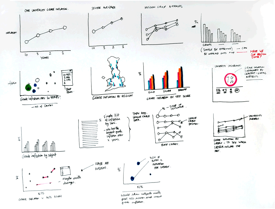
When I finally got to this bit I was a little conflicted - I was excited at working with data and how I might realise some ideas on how to present the data, and a bit frustrated that my skills were a long way from being able to realise my ideas. Faced with that dilemma, I did what I’m comfortable with and drew some things - I drew the following ideas and starting points on how to present the data - with the user stories in mind throughout.

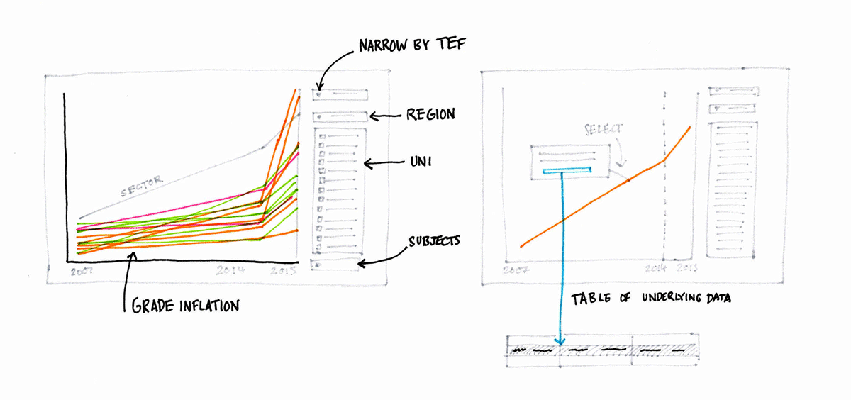
However in the time available we decided to stick to a simple line chart to illustrate the data points which shows the rise - especially when you show just Firsts awarded. It was pretty clear that some institutions were showing high percentage increases in the volume of firsts awarded - but that point about volume is important. For example grade inflation could go up a lot at a University because they’ve had a large increase in graduates - digging into the data unearths these things, so I found it a great exercise - to start visualising something which then make you pose questions about what you see. I built the first part of a dashboard - about as far as my new skill took me and then it was developed further by the rest of the team. It was a good sign to start exploring the data and see which subjects were inflating the most in an organisation - the presentation of the info was encouraging curiosity.
I’ve drawn an approximation of what we built, as all the real dashboards are restricted to people with the appropriate access.
 Sketches of dashboard
In the end I was pleased with what I managed to achieve in the time available and really look forward to what the next teams through the process manage to do.
Digital Collaboration
I’ve mentioned time constraints on the project and it’s worth mentioning how things were set up. The team met first in a face to face kick off meeting in Manchester where were also introduced to the whole project and given user stories to start on. We then started the work in earnest with a Face to Face meeting, followed by online sprints that were a day of getting on with task from the Trello board, bookended by Skype meetings. In total we had 4 face to face and 8 online sessions, and looking back, the team managed to do a lot of work with such a time-boxed way of working.
Understanding Policy and the Digital Landscape
This one of the core competencies was interesting, I’d say that this one depended most of the meeting the rest of the team and drawing on the experience of people who do this for a day job and were taking the opportunity to explore the edges of their respective areas. I learnt a lot of those pesky acronyms. The dashboards we produced and those of the other teams really opened my eyes to how much data has been collected about students, staff and universities, and connecting that data up is leading to some useful insights. As the dashboards mature and dare I say a new generation of planners emerges, I can see how the use of dashboards will become central to people’s work. You can see some examples of this on the WonkHE Data section of the site
Overall
In summary the project was pretty demanding, taking me out my comfort zone on multiple areas. It was a little stressful at times during the online sprints when I started the day not feeling that I was up to the task, or I was unclear how to proceed. The agile concept of asking if anyone had blockers was handy but of limited value when the answer was to start work, and keep going. At the end of most days I was reasonably satisfied with my effort, and the face to face days were very productive. I probably didn’t get to do as much Tableau hands on as I expected, but could see that wrangling the data was crucial groundwork.
I met some lovely, helpful and clever people and got some great insights into how to develop useful Business Intelligence products - something I hope to bring back to the day job. It looks like we’ll be using a different set of products to do our BI, but most of what I’ve learnt is transferrable and the wider perspective is very relevant.
I guess there’s something to be said for volunteering without overthinking it and then pushing through.
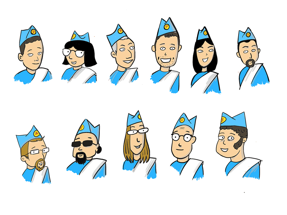
Oh, and I couldn’t help but do a drawing of the team.

